

Healthcare Access Analysis by Electoral District (ED)
Project Overview
This project represents my first in-depth application of GIS analysis techniques, focusing on healthcare accessibility and spatial disparities across Ireland's electoral districts (EDs). The study integrates multiple geospatial and statistical methodologies, including spatial joins, buffer analysis, raster-based visualization, and statistical comparison of health vulnerability scores.
While this analysis serves as an academic exercise in developing GIS technical proficiency, it provides insights into accessibility challenges faced by at-risk populations, including the elderly, disabled, and those reporting poor health, as well as the distribution of healthcare facilities across Ireland.
Key Insights (At a Glance)
- Accessibility to hospitals varies significantly across different regions, with rural areas generally having fewer facilities within reasonable travel distances.
- Western and northwestern regions contain a high concentration of vulnerable populations and fewer healthcare facilities.
- Areas located outside the 25 km hospital buffer zones exhibit higher mean HVI scores and greater disparities in health vulnerability compared to areas with closer proximity to hospitals.
Methodology Overview
This study applied a structured GIS workflow to analyze healthcare accessibility, integrating both vector-based and statistical spatial techniques. The core analytical steps included:
Data Processing & Integration
- Electoral district boundaries were combined with census demographic data using spatial joins.
- Health indicators, including age distribution, disability status, and self-reported poor health, were extracted as key vulnerability factors.
- Hospital locations were imported as georeferenced point features for proximity analysis.
Health Vulnerability Index (HVI) Construction
-
Key health indicators were normalized to enable comparative analysis.
-
A composite index was calculated by averaging the selected health risk factors:
- HVI = (Elderly Population % + Disabled Population % + Poor Health %) / 3
-
Each electoral district was assigned a quantile-based score to visualize regional health disparities.
Accessibility Analysis
- A 25 km buffer was created around hospitals to approximate reasonable travel distance for healthcare access.
- The spatial distribution of HVI scores was compared against hospital service areas to detect underserved regions.
- Electoral districts were classified as "Served" (within buffer) or "Underserved" (outside buffer) to facilitate statistical comparisons.
Statistical & Visual Analysis
- Descriptive statistics, including mean, median, and variance, were computed to compare HVI distributions inside and outside the buffer zones.
- Choropleth maps were generated to visualize HVI scores, hospital coverage, and accessibility gaps.
Click to expand full methodology (extract from academic writeup)
Data Processing & Integration
I began by importing the assignment's data layers and reviewing their attribute tables, focusing specifically on the electoral district (ED) shapefile, which lacked detailed attribute data. To supplement this data, I performed a join between the EDs_2022_SAPS and EDs2022 layers using the GUID column as the primary key, which perfectly matched the ED_GUID field in the shapefile.
With variables now linked spatially, I selected three key indicators for the analysis: the Over 65 population, people with disabilities, and those reporting poor health. These groups were chosen because they represent populations with significantly higher healthcare needs. The next step was to quantify these variables by creating new count fields for each population group in every ED using the Field Calculator in QGIS. Summing the relevant fields from the census data allowed me to generate counts for each variable, including the Over 65 population, disabled population, and people reporting poor health.
Health Vulnerability Index (HVI) Construction
I calculated the percentage of each population group relative to the total ED population, producing rate fields for each variable. Normalising these values allowed for a balanced comparison of health vulnerability across EDs, regardless of population size.
I next constructed a Health Vulnerability Index (HVI). This measure combined the three variables - Over 65s, disabled population, and poor health - with each variable equally weighted. This allowed for a more comprehensive comparison of health vulnerability across the region, simplifying the identification of areas with greater healthcare needs.
I created a choropleth map to visualise the HVI across all EDs, highlighting the areas with the highest vulnerability based on the composite factors.
Accessibility Analysis
To evaluate healthcare accessibility, I conducted a buffer analysis around hospital locations, selecting a 25 km buffer zone to represent a reasonable travel distance for both rural and urban populations. I overlaid the buffer on the HVI choropleth to determine which of the most vulnerable EDs fell outside the buffer zones.
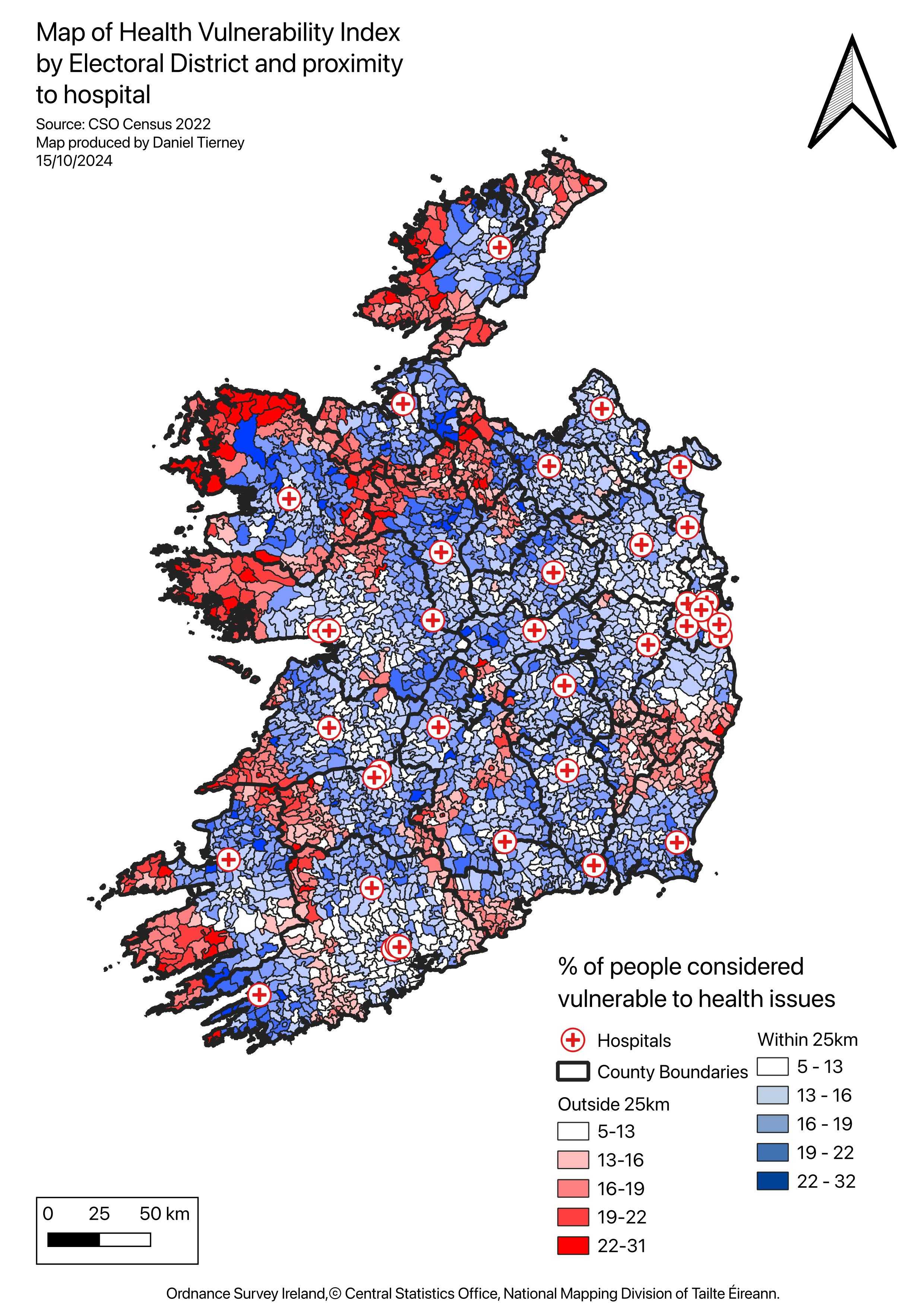
Using a spatial query, I next classified EDs based on whether they fell inside or outside the 25 km buffer zones. EDs within the buffer were coloured blue, while those outside were red, emphasising the areas that are both vulnerable and underserved. This clearly shows the spatial relationship between health vulnerability and hospital proximity, making it easier to pinpoint the most vulnerable regions with limited access to healthcare facilities.
Statistical & Visual Analysis
To further analyse the differences between these areas, I compared the statistical summaries of the two layers. This comparison showed significant differences in the mean, median, and variability of the Health Vulnerability Index (HVI) between the two groups, with areas outside the buffer showing consistently higher vulnerability scores. These findings reinforced the visual insights from the map, highlighting underserved regions where both health vulnerability and poor hospital access converge.
Findings & Visualizations
Health Vulnerability Index (HVI) by Electoral District
This map highlights high-risk areas based on demographic vulnerability factors.
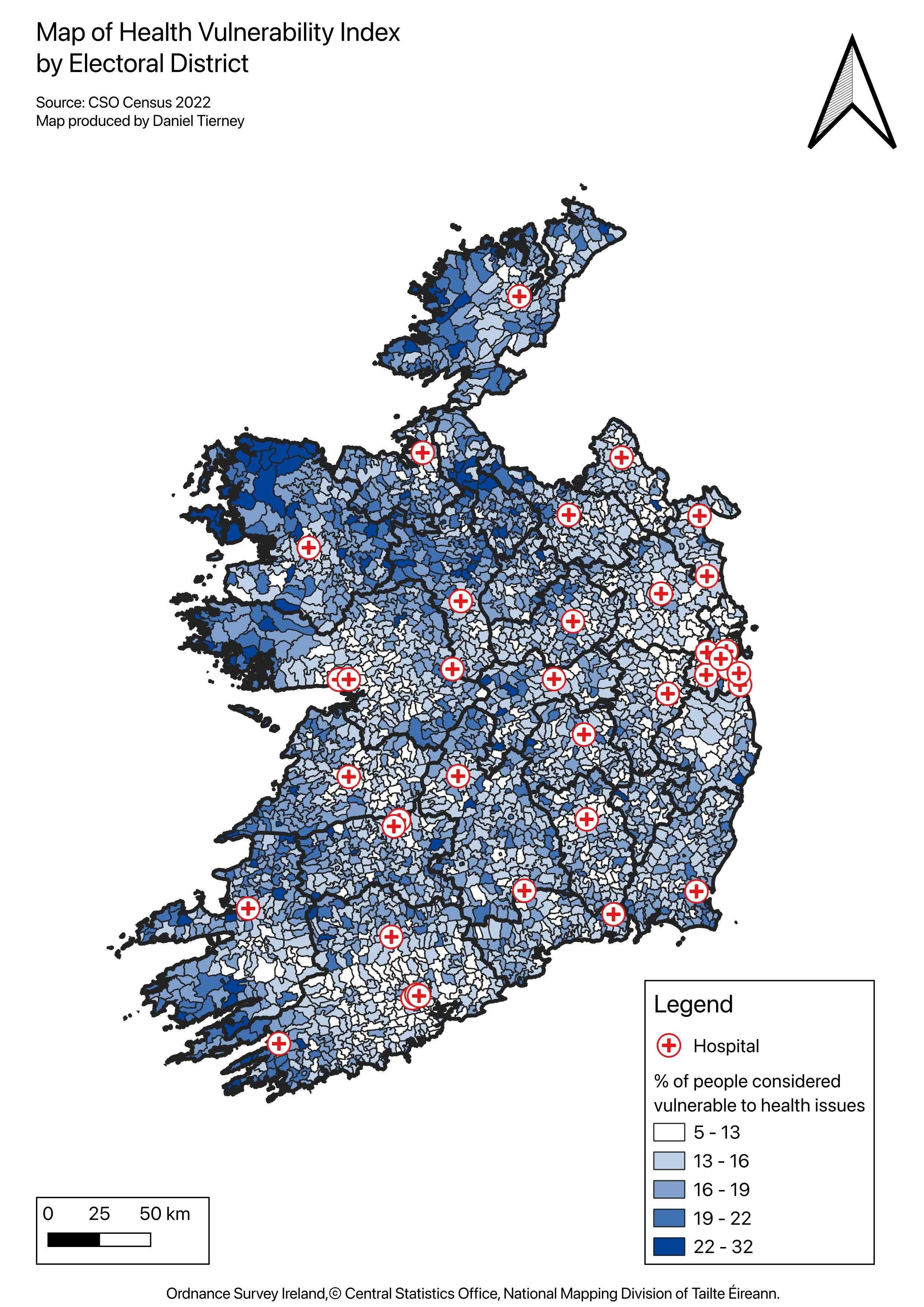 Figure 1. HVI concentration by electoral district.
Hospital Accessibility (Buffer Analysis)
This map illustrates hospital service areas and electoral districts located outside the 25 km buffer zones.
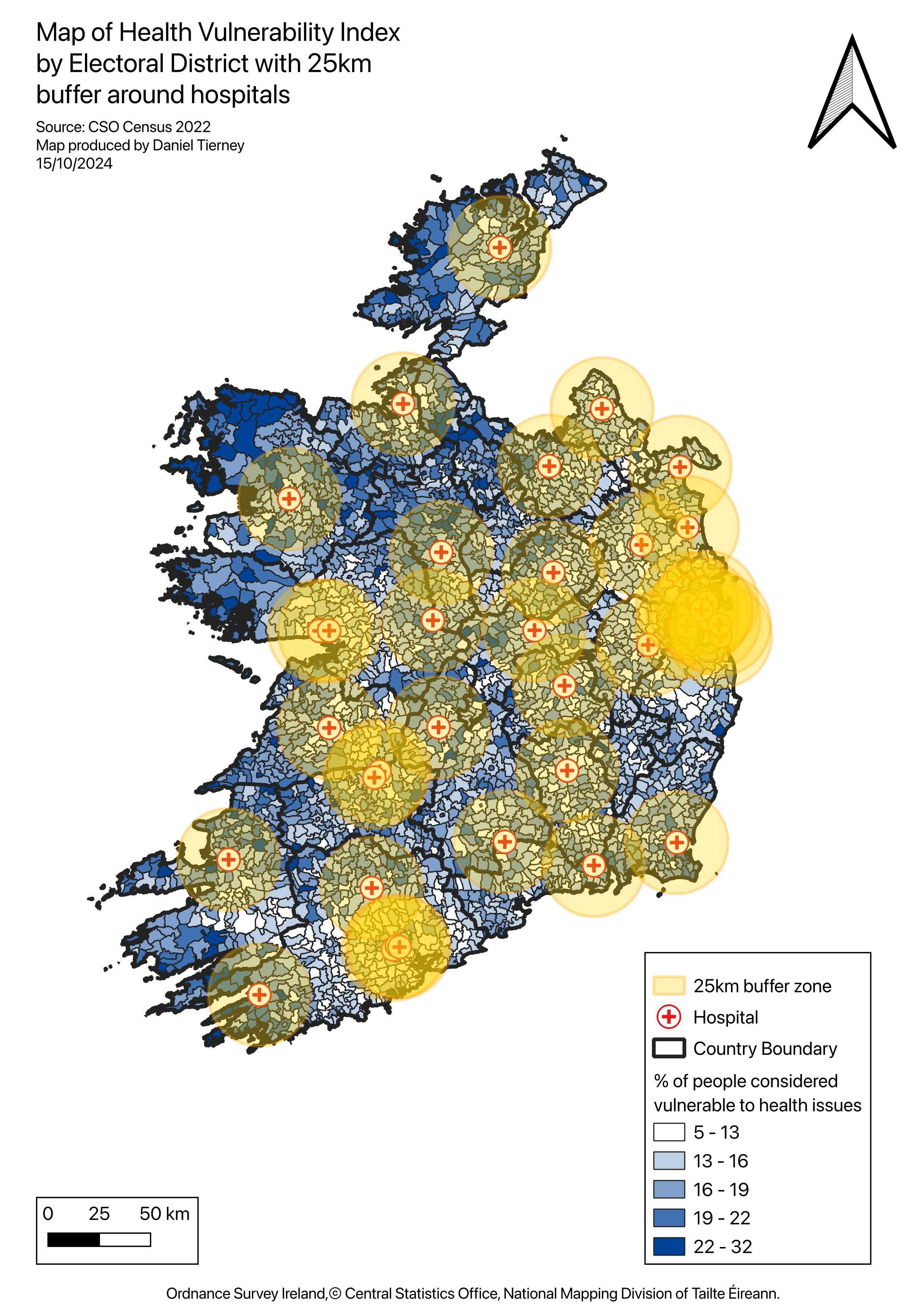 Figure 2. 25 km hospital buffers overlaid on HVI choropleth.
Underserved & High-Vulnerability Areas
Electoral districts are categorized by accessibility and vulnerability levels.
- Blue areas indicate locations within 25 km hospital access.
- Red areas indicate high vulnerability combined with limited access.
 Figure 3. Underserved electoral districts outside hospital buffers.
Key Takeaways
- There is a significant rural-urban divide in healthcare accessibility.
- Western and northwestern Ireland exhibit high HVI scores along with poor hospital access.
- Even in urban areas, socioeconomic barriers contribute to high vulnerability despite closer hospital proximity.