

This project uses Dublin census data to show a basic but important cartographic problem: mapped change is only trustworthy when the comparison is designed properly. If two choropleths use different class breaks, apparent population shifts can be created by the map design rather than by the data itself.
I used R to build two electoral-district choropleths for 2006 and 2016 with the same classification scheme, allowing the decade to be read consistently across both outputs. The value of the project is therefore methodological as much as visual: it shows how a straightforward workflow can produce a defensible comparison instead of a misleading pair of maps.
I later returned to Dublin with a more environmental dataset in Mapping Dublin's Air Quality, but this post is the simpler census-mapping foundation behind that later work.
Background
The period from 2006 to 2016 captures a decade of major change in Dublin, including post-crash adjustment, continued suburban development, and uneven population growth across the urban region. Electoral district census data provides a useful geography for showing those shifts at a scale that is detailed enough to reveal local patterning without becoming unreadable.
Data and Method
Inputs
The analysis used:
- a shapefile of Dublin electoral district boundaries
- total population counts from the 2006 Census
- total population counts from the 2016 Census
The focus here is deliberately narrow. Rather than trying to map multiple socioeconomic indicators at once, the post concentrates on population totals and the cartographic choices needed to compare them properly.
Tooling
I used R and a small set of spatial and mapping packages:
library(sp)          # Spatial data handling
library(sf)          # Simple features for R
library(RColorBrewer) # Colour palettes
library(shades)      # Colour manipulation
library(tmap)        # Thematic mapping
library(GISTools)    # Additional mapping tools
Mapping Approach
The workflow had three main steps:
- Load the Dublin electoral district geometry and prepare it for mapping in R.
- Apply the same population classification logic to both years.
- Render two choropleths with the same visual scale so differences remain interpretable.
The key methodological choice was to use equal-interval classification rather than let each map define its own breaks. That ensures the same shade of green represents the same population range in both years.
# Load the shapefile for Dublin Electoral Districts
Dublin <- st_read("Dublin_EDs.shp")

# Convert to SpatialPolygonsDataFrame
Dublin_spdf <- as_Spatial(Dublin)
# Define shading with equal intervals
vacant.shades = auto.shading(Dublin_spdf$Pop_06, cols = brewer.pal(5, "Greens"), cutter = rangeCuts)
# Create choropleth map
choropleth(sp = Dublin_spdf, v = "Pop_06", shading = vacant.shades)
# Add map elements
choro.legend(533000, 161000, vacant.shades)
title('Dublin EDs by Population 2006')
north.arrow(xb = 691500, yb = 760000, len = 2000, col = "lightgreen")
map.scale(691500, 718500, 5000, "km", 1, 5)Results
Dublin Population, 2006
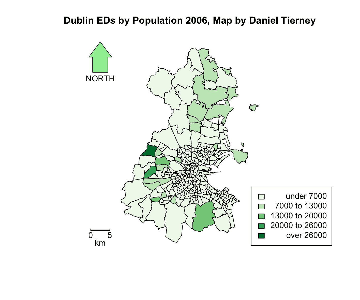 Figure 1: Dublin population by electoral district in 2006.
Dublin Population, 2016
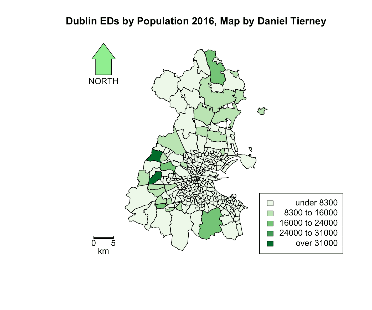 Figure 2: Dublin population by electoral district in 2016.
Interpretation
Viewed together, the maps show three broad patterns:
- Overall growth: many districts appear darker in 2016, indicating population increase across much of the city-region.
- Suburban expansion: some of the strongest shifts appear in outer suburban districts, especially to the north and west.
- Stable cores: districts that were already heavily populated in 2006 broadly remained major population centres in 2016.
The value of the project is not just that it maps Dublin's growth, but that it does so in a way that preserves fair comparison. If each year used a different scale, some of that visual story would become much harder to trust.
Cartographic Decision: Why Equal Intervals Matter
When comparing maps across time, the classification method matters as much as the data itself.
- A shared colour scale makes the comparison intuitive.
- Equal-interval classification keeps identical population ranges tied to identical colours.
- Standard map elements such as legends, scale bars, and north arrows keep the output readable and reproducible.
This is a modest project, but it demonstrates a useful GIS principle: comparative mapping only works when the design choices support comparison.
Wrapping Up
This project remains useful in the portfolio because its analytical choice is explicit. The point is not just to produce two clean maps of Dublin, but to show that comparative mapping depends on classification choices that are transparent and consistent.
At a city scale, the results suggest outward growth and continued suburbanisation across the decade. At a methods level, the post demonstrates a compact R workflow for turning census counts into comparable choropleths without losing sight of the cartographic decisions that make that comparison credible.
For a smaller-scale demographic mapping project built around one locality rather than a whole city, Mapping Ardmore in the 1926 Census shows where this kind of census visualisation eventually led.
Full Code
# Import the necessary libraries
library(sp)
library(sf)
library(RColorBrewer)
library(shades)
library(tmap)
library(GISTools)

# Load the shapefile for Dublin Electoral Districts
Dublin <- st_read("Dublin_EDs.shp")

# Convert the loaded data to a SpatialPolygonsDataFrame
Dublin_spdf <- as_Spatial(Dublin)

# Setting up the plotting area
par(mar=c(1,1,1,1))

# Define shading for the 2006 population using 'Greens' colour palette and equal intervals
vacant.shades = auto.shading(Dublin_spdf$Pop_06, cols = brewer.pal(5, "Greens"), cutter = rangeCuts)

# Draw the choropleth map for 2006 population with the defined shading
choropleth(sp = Dublin_spdf, v = "Pop_06", shading = vacant.shades)

# Add map elements
choro.legend(533000, 161000, vacant.shades)
title('Dublin EDs by Population 2006')
north.arrow(xb = 691500, yb = 760000, len = 2000, col = "lightgreen")
map.scale(691500, 718500, 5000, "km", 1, 5)

# Repeat for 2016 population data
vacant.shades = auto.shading(Dublin_spdf$Pop_16, cols=brewer.pal(5,"Greens"), cutter=rangeCuts)
choropleth(sp=Dublin_spdf, v="Pop_16", shading=vacant.shades)
choro.legend(533000,161000, vacant.shades)
title('Dublin EDs by Population 2016')
north.arrow(xb = 691500, yb = 760000, len = 2000, col = "lightgreen")
map.scale(691500, 718500, 5000, "km", 1, 5)
And here is the helper used to create equal intervals:
rangeCuts <- function(v, n) {
  min_val <- min(v, na.rm = TRUE)
  max_val <- max(v, na.rm = TRUE)

  data_range <- max_val - min_val
  interval_width <- data_range / n
  breaks <- min_val + (0:n) * interval_width

  return(breaks)
}