

Healthcare Access Analysis by Electoral District
This project asks a practical spatial question: where in Ireland do populations with higher health vulnerability also have weaker proximity to hospital services? Rather than looking at need and access separately, it combines both into a national screening analysis that makes potential service gaps visible at electoral-district level.
I used electoral district boundaries, census-derived vulnerability indicators, and hospital locations to build a composite Health Vulnerability Index and compare it against a 25 km hospital-access buffer. The result is a clear first-pass map of underserved areas and a compact example of how GIS can combine demographic risk, proximity analysis, and summary statistics in one workflow.
If you want a later public-interest mapping project focused on environmental exposure rather than service access, Mapping Dublin's Air Quality takes a similar place-based approach in an urban setting.
Key Insights
- Accessibility to hospitals varies sharply between regions, with many rural areas falling outside the main service buffers.
- Western and northwestern districts show a recurring overlap between higher vulnerability scores and weaker hospital proximity.
- Districts outside the 25 km buffers show higher average vulnerability than those located closer to hospitals.
Methodology Overview
The workflow combined demographic indicators, spatial joins, buffer analysis, and summary comparison.
For a simpler choropleth workflow using electoral district geography, Mapping Dublin's Population Change with R shows an earlier census-mapping example with a narrower analytical goal.
Data Processing and Integration
- Electoral district boundaries were linked to census demographic fields.
- Three indicators were selected as a basic vulnerability frame: older population share, disability, and self-reported poor health.
- Hospital locations were imported as point features for proximity analysis.
Health Vulnerability Index
- Each indicator was converted into a rate relative to district population.
- A composite Health Vulnerability Index (HVI) was created using equal weighting:
HVI = (Elderly Population % + Disabled Population % + Poor Health %) / 3
- Districts were then classified to show the spatial distribution of vulnerability.
Accessibility Analysis
- A 25 km buffer around hospital locations was used as a broad proxy for service access.
- Electoral districts were classified as inside or outside those buffers.
- HVI patterns were then compared against hospital coverage to identify underserved areas.
Statistical Comparison
- Mean, median, and variance were compared for districts inside and outside the service buffers.
- The mapped results were supported with summary statistics rather than left as a visual impression alone.
Optional implementation detail
The workflow depended on joining electoral district boundaries to census attributes, then constructing derived fields for the three vulnerability indicators. Once those rates were calculated, the HVI could be mapped as a composite measure rather than as three separate demographic layers.
The hospital-access step used a 25 km buffer as a broad national proxy rather than as a claim about exact travel time. That simplification matters. It does not capture road quality, public transport, or terrain, but it does provide a consistent first pass for comparing proximity across the full country.
The final comparison combined the mapped HVI surface with the in-buffer / out-of-buffer classification so the accessibility question could be assessed both visually and statistically.
Findings and Visualisations
Health Vulnerability Index by Electoral District
This map highlights where the combined vulnerability indicators are highest.
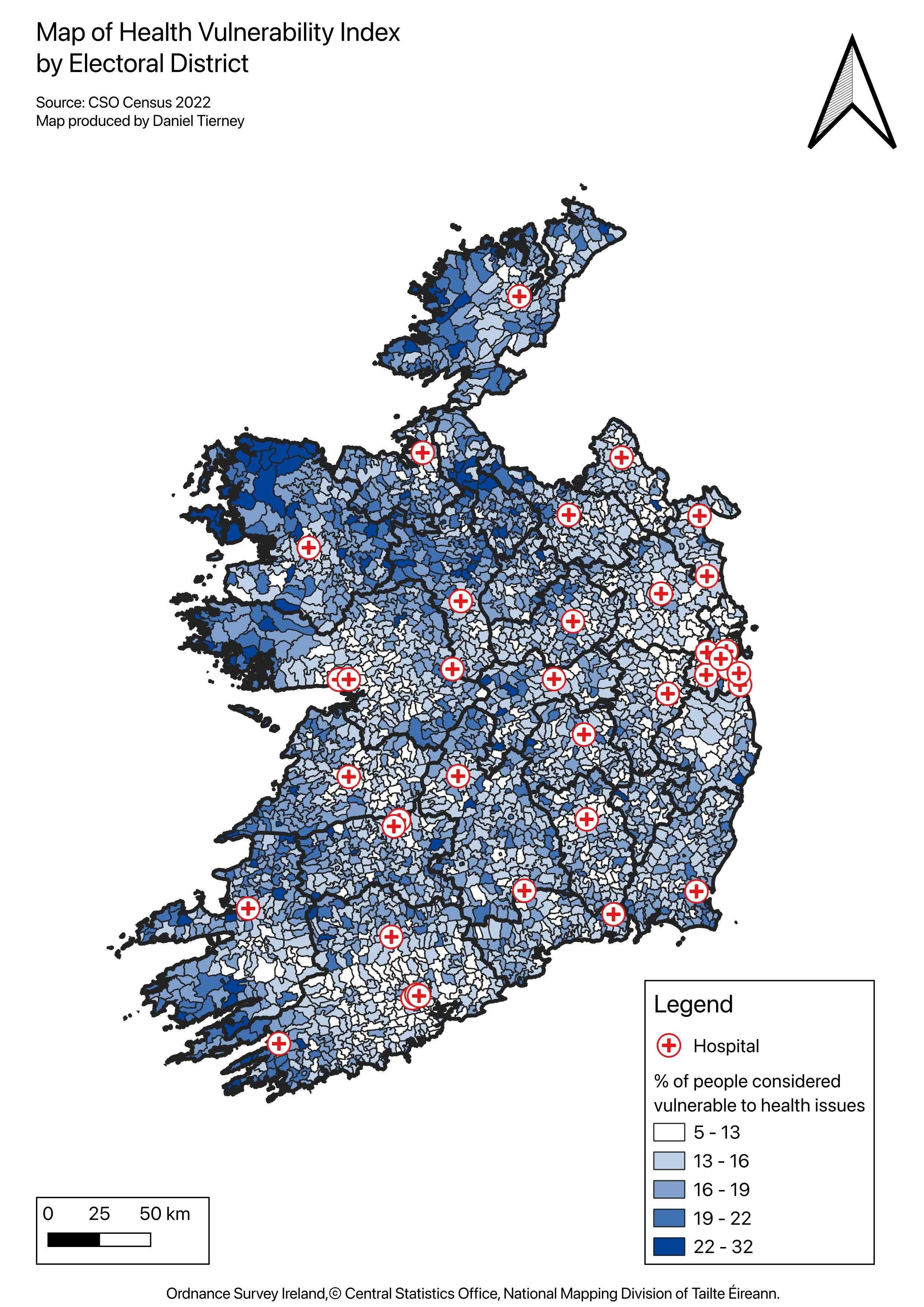 Figure 1. HVI concentration by electoral district.
Hospital Accessibility Buffer Analysis
This map shows the relationship between hospital service buffers and district-level vulnerability.
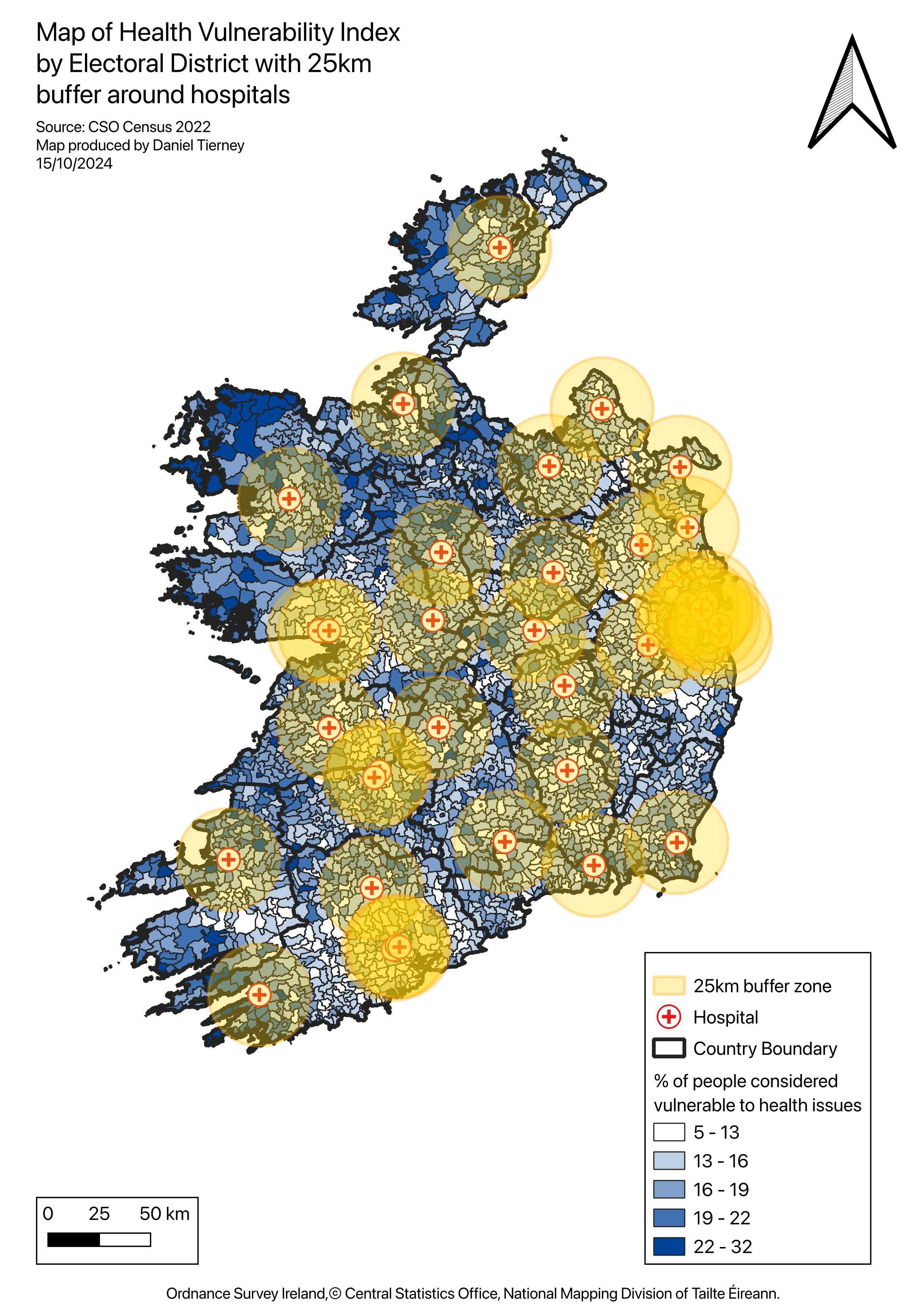 Figure 2. 25 km hospital buffers overlaid on the HVI choropleth.
Underserved High-Vulnerability Areas
Electoral districts are grouped by whether they fall inside or outside the hospital buffers.
- Blue areas indicate districts within 25 km of a hospital.
- Red areas indicate districts outside the buffers, where weaker access overlaps with higher vulnerability.
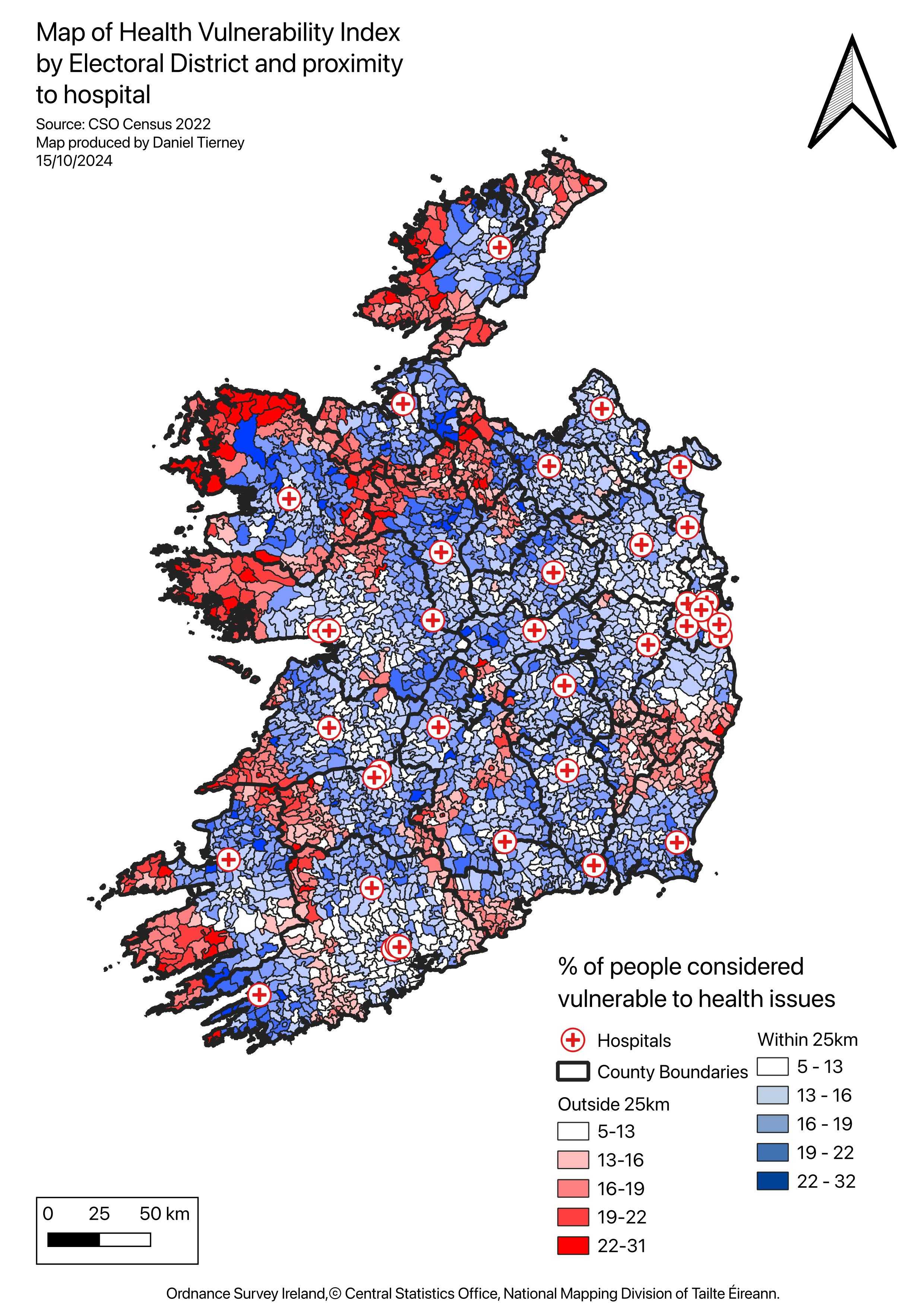 Figure 3. Electoral districts outside the hospital buffers.
Why It Matters
This analysis is intentionally simplified, but it makes one pattern clear: healthcare vulnerability and healthcare access do not align evenly across Ireland. Districts with older or less healthy populations are often the same places where proximity to hospitals is weaker.
That does not mean a 25 km buffer is a complete measure of access. It is only a starting point. Travel time, transport options, service capacity, and local deprivation all matter too. Even so, the workflow is useful because it turns a broad national question into something spatially legible and comparable.
As a portfolio piece, the project demonstrates a practical GIS workflow for moving from raw demographic and service-location data to an interpretable spatial decision aid. The method could be extended with drive-time analysis, service hierarchy, or primary-care coverage, but even in this form it shows how mapping, indexing, and proximity analysis can be combined to identify gaps between need and provision.