

Dublin's air quality is usually discussed through a small number of fixed monitoring stations. Those stations are valuable, but they cannot show how sharply pollution can vary from one corridor or neighbourhood to the next.
This project uses mobile monitoring data collected by Google Street View cars to map street-level variation in three pollutants across the city: nitrogen dioxide (NO2), particulate matter (PM2.5), and ground-level ozone (O3). The aim was to turn thousands of point observations into a more interpretable picture of where urban exposure is concentrated and how pollutant patterns differ.
For another public-interest health geography project focused on access rather than environmental exposure, see Mapping Healthcare Access and Vulnerability in Ireland.
Why This Dataset Matters
Traditional air monitoring offers accuracy at fixed points. Mobile monitoring offers something different: dense spatial coverage along the street network. That makes it possible to see localised variation that would be missed by sparse station data alone.
The Dublin dataset came from Project Air View, a collaboration between Google and Dublin City Council. From May 2021 to August 2022, instrumented Street View vehicles recorded pollution measurements across the city at street level.
Method
The raw dataset consisted of many discrete point measurements. To make those observations interpretable at city scale, I used a short GIS workflow:
If you want a simpler Dublin comparison built from census geography rather than pollution observations, Mapping Dublin's Population Change with R shows an earlier choropleth workflow.
- Data preparation: import the CSV into ArcGIS Pro and map each record by latitude and longitude.
- Pollutant selection: focus on NO2, PM2.5, and O3 as the most useful comparison set.
- Spatial interpolation: use Empirical Bayesian Kriging (EBK) to estimate pollution levels between measured locations.
- Classification: move from a strict EPA-style health index to Jenks Natural Breaks where necessary to better reveal local variation.
- Threshold analysis: identify areas exceeding the 2021 WHO guideline thresholds and map overlapping hotspots.
Pollutants
- NO2 highlights traffic-related pollution, especially along major roads.
- PM2.5 captures a broader mix of traffic, industrial, shipping, and domestic sources.
- O3 behaves differently because it is formed through atmospheric reactions rather than emitted directly.
Why EBK
Empirical Bayesian Kriging was the key analytical choice. The dataset contains dense but unevenly distributed observations, and EBK provides a more robust interpolation framework than a simple deterministic surface. It is especially useful where environmental patterns are spatially complex and uncertainty should not be ignored.
Classification Decision
I first tested the data against the EPA's Air Quality Index for Health categories. That was useful from a health-communication perspective, but it flattened much of the intra-urban variation because large parts of Dublin fell into the same lower categories.
To show spatial contrast more clearly, I switched to Jenks Natural Breaks for the mapped surfaces while still using WHO thresholds for the hotspot analysis. That combination preserved both interpretability and analytical contrast.
Results
Nitrogen Dioxide (NO2)
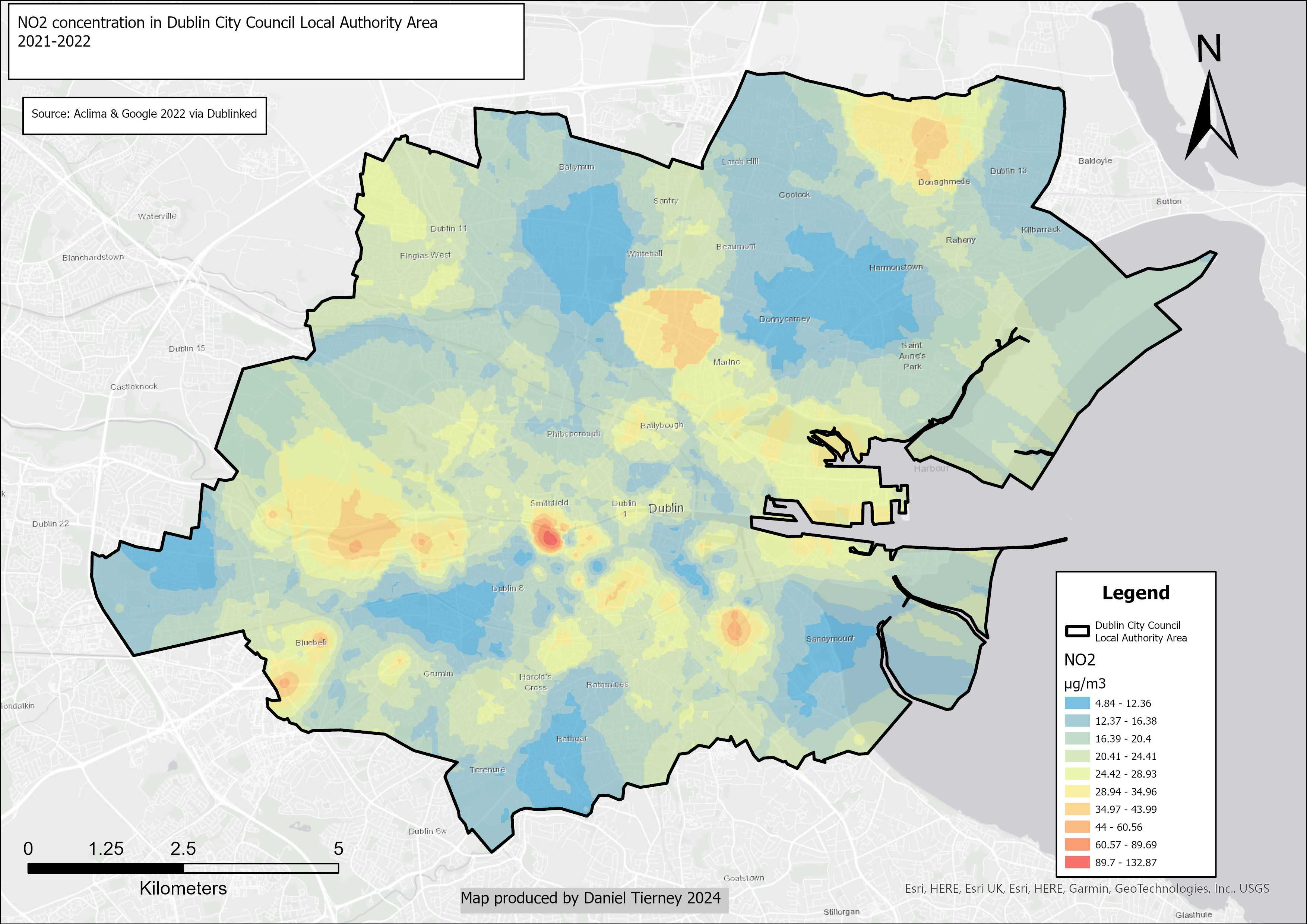 Figure 1: Nitrogen dioxide concentration in Dublin. The Naas Road area, Drumcondra and Bridge Street Upper show higher levels than much of the rest of the city.
NO2 tracks major traffic corridors closely. The strongest concentrations appear along commuter routes and busy approaches to the city centre, especially around the Naas Road, Drumcondra, and Bridge Street Upper.
Ozone (O3)
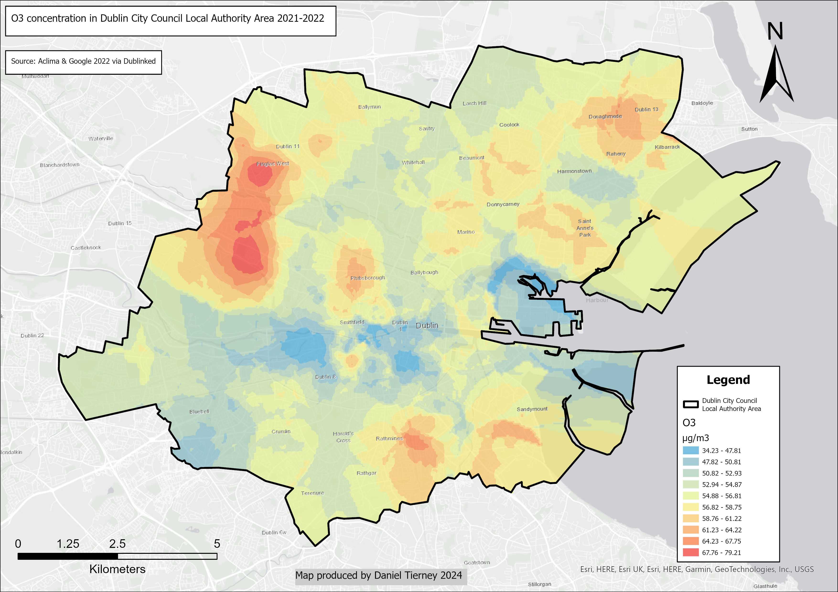 Figure 2: Ozone concentration in Dublin. The Navan Road area, Finglas West, North Circular Road, Ranelagh/Rathmines, and Shrewsbury Road/Merrion Road (D4) show comparatively high levels.
Ozone follows a more complicated pattern. Because it forms through chemical reactions involving other pollutants and sunlight, it does not simply mirror the NO2 map. Some areas with high traffic-related emissions can show different ozone behaviour because of those atmospheric interactions.
Particulate Matter (PM2.5)
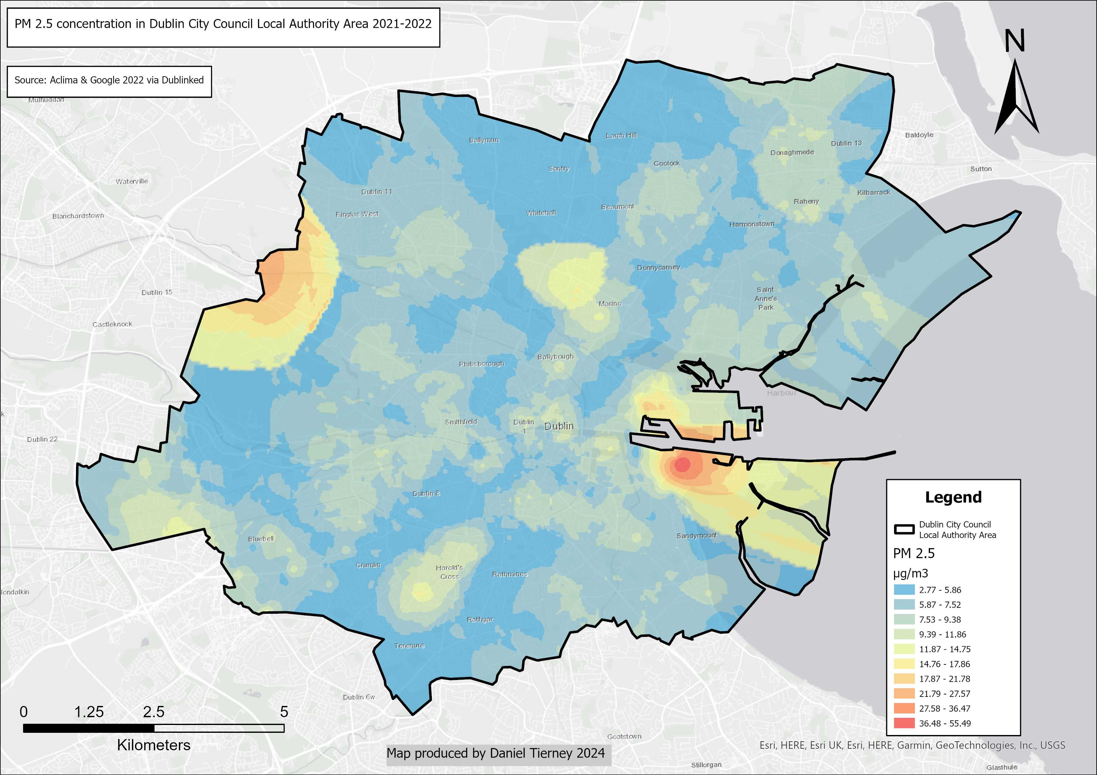 Figure 3: Particulate matter (PM2.5) concentration in Dublin. Ashtown Road, Irishtown and Dublin Port are among the most notable higher-concentration areas.
PM2.5 points toward a broader set of emission sources. Dublin Port, Irishtown, and the Ashtown Road area stand out most clearly, suggesting a mix of industrial, transport, and other local source effects.
Multi-Pollutant Hotspots
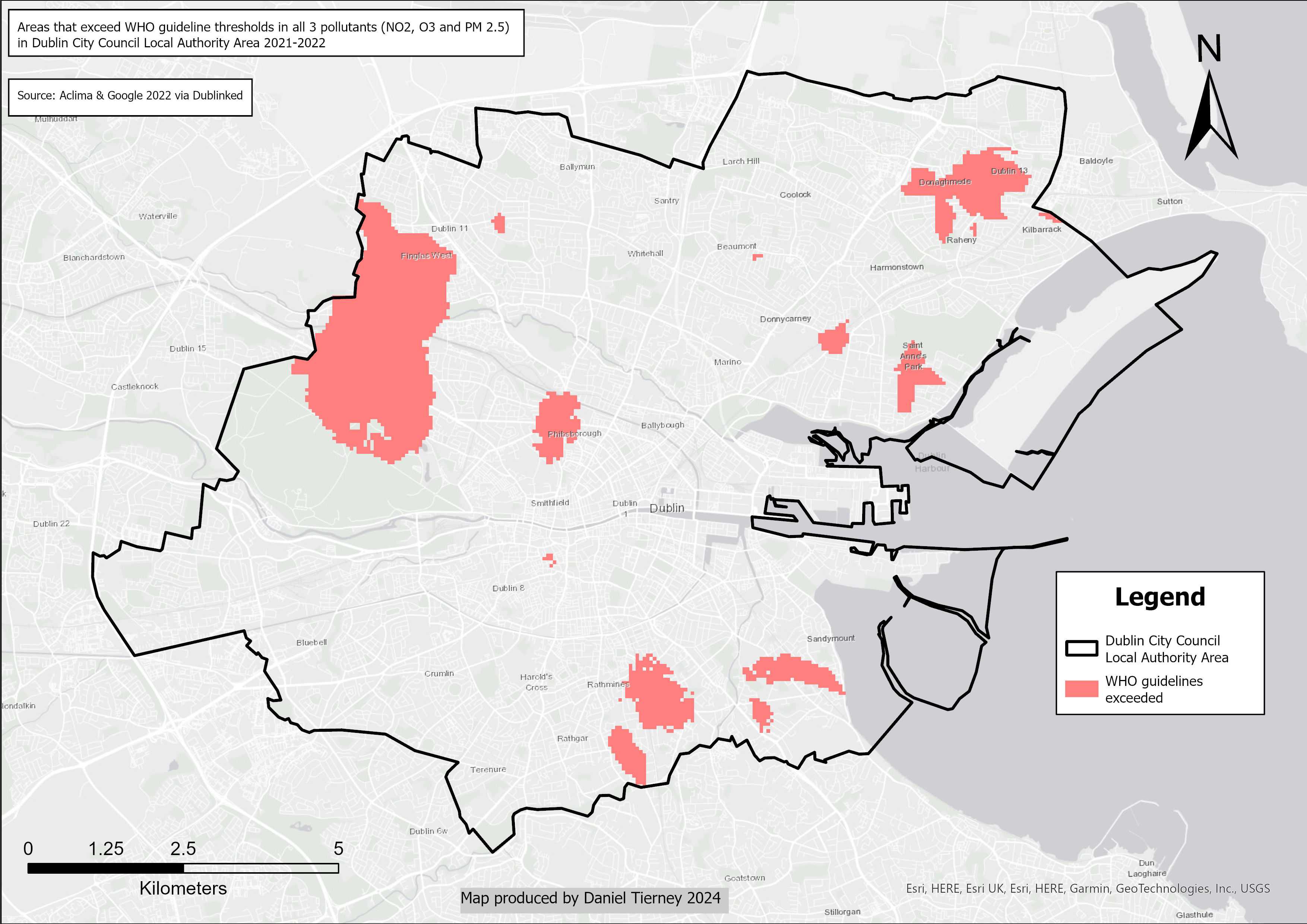 Figure 4: Areas in Dublin exceeding WHO guideline thresholds in all three pollutants, including Finglas West, Phibsborough, Donaghmede, Ranelagh, Sandymount, Palmerstown, and Donnybrook.
The most important output is the overlap map showing where all three pollutants exceed WHO guideline thresholds. Those locations represent the clearest candidate hotspots for further investigation because the concern is not a single pollutant but combined exposure.
Interpretation
Several patterns matter here:
- traffic corridors dominate NO2 concentration
- PM2.5 highlights a wider mix of sources, including port and industrial influence
- O3 behaves differently enough that a single-pollutant reading of the city would be misleading
- some of the highest-risk areas cut across very different neighbourhood types
That last point is worth noting. Air pollution does not map neatly onto a single social geography. Some hotspots sit in affluent districts, others in working-class areas. Exposure is spatially uneven, but not in a single-direction pattern.
Why It Matters
The value of this project is that it makes invisible variation visible. Instead of treating Dublin's air quality as a city-wide average, the analysis shows where street-level concentration is likely to be most acute and where multiple pollutants coincide.
For planning and public-health interpretation, that matters. Different pollutants imply different intervention points: traffic management, industrial controls, greener street design, or more targeted local monitoring. The maps are not a final policy answer, but they do show where further attention is most justified.
Next Steps
There are several obvious extensions:
- compare seasonal or weather-driven variation
- relate the surfaces to demographic vulnerability
- track whether hotspot patterns shift as air-quality measures are introduced
- link the mapped patterns to health or transport indicators
As a portfolio project, this piece demonstrates interpolation, raster analysis, classification choices, and environmental interpretation in one workflow. It is less about producing a static map and more about showing how GIS can turn a dense but fragmented monitoring dataset into a usable spatial argument.
Data Source
The analysis uses Google Project Air View (2022) "Dublin City Measurements CSV", available through data.gov.ie. The source data was collected in collaboration with Dublin City Council between May 2021 and August 2022.