

This post sits a little outside conventional GIS work, but the underlying question is relevant to spatial analysis: how can large text datasets be turned into interpretable signals that could later be mapped?
To explore that, I used a dataset of 15,000 tweets about Avengers Endgame and tested three common lexicon-based sentiment methods in R. The dataset is not geographic in itself, but it works as a useful prototype for building a repeatable text-analysis workflow before applying similar methods to place-based public commentary, planning responses, visitor feedback, or local event data.
While this example uses social media rather than explicit geographic features, it fits the same broader interest as projects like Mapping Dublin's Air Quality and Building a Real-Time Flood Monitoring Dashboard for Midleton: extracting patterns from noisy public data and turning them into something more legible.
Why Sentiment Analysis Matters for GIS
Maps usually show where things are happening. They are less good at capturing how people describe, judge, or react to those places. Social text can help fill that gap.
If posts, comments, or reviews can be tied to location, sentiment analysis offers one route toward:
- comparing how places are perceived
- tracking reaction to development or infrastructure changes
- identifying clusters of frustration, satisfaction, or concern
- adding a social layer to otherwise physical or administrative datasets
This project does not complete that final spatial step, but it does establish the text-processing side of the workflow.
Method
The analysis followed a simple R-based pipeline:
- clean the tweet text
- tokenise it into individual words
- remove common stop words
- join the remaining tokens against sentiment lexicons
- summarise and visualise the results
I used tidytext for tokenisation and lexicon joins, dplyr for transformation, and ggplot2 for the output charts.
Comparing Three Lexicon Approaches
The main value of the project is comparative rather than predictive. Each lexicon provides a different way to interpret the same corpus.
1. Bing: Positive vs Negative
The Bing lexicon reduces the analysis to a binary distinction between positive and negative terms.
Lexicon <- get_sentiments("bing")

Analysis <- Clean %>%
  inner_join(Lexicon, by = "word") %>%
  group_by(sentiment) %>%
  summarize(count = n())

ggplot(Analysis, aes(x = sentiment, y = count, fill = sentiment)) +
  geom_bar(stat = "identity", color = "black") +
  scale_fill_brewer(palette = "Pastel1") +
  labs(title = "Binary Sentiment Analysis",
       x = "Sentiment", y = "Count") +
  theme_minimal()
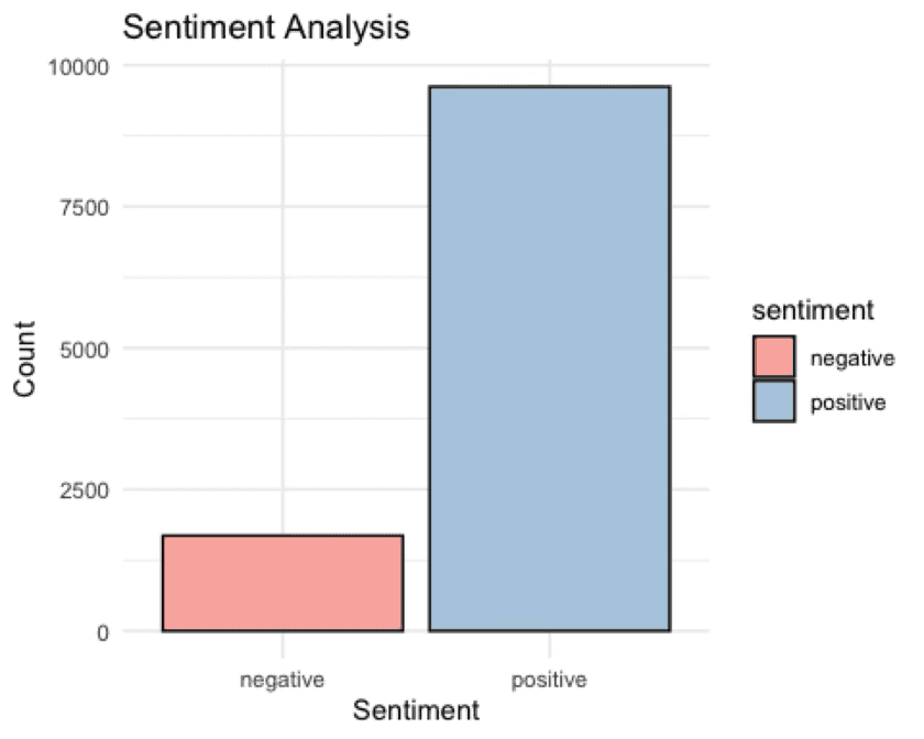 Figure 1: Binary sentiment analysis using the Bing lexicon.
This is the fastest and most legible version of the workflow, but also the least nuanced.
2. NRC: Emotional Categories
The NRC lexicon expands the analysis into categories such as joy, fear, anger, trust, anticipation, and sadness.
Lexicon2 <- get_sentiments("nrc")

Analysis2 <- Clean %>%
  inner_join(Lexicon2, by = "word") %>%
  group_by(sentiment) %>%
  summarize(count = n())

ggplot(Analysis2, aes(x = sentiment, y = count, fill = sentiment)) +
  geom_bar(stat = "identity") +
  labs(title = "Emotional Category Analysis",
       x = "Sentiment",
       y = "Count") +
  theme_minimal()
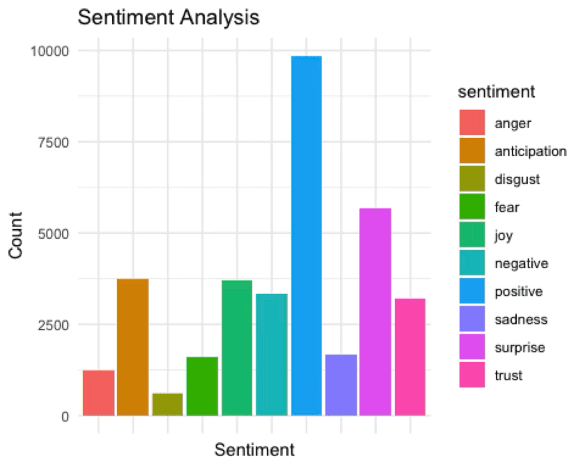 Figure 2: Emotional category analysis using the NRC lexicon.
This produces a richer emotional profile, which is more useful when binary sentiment would flatten important distinctions.
3. AFINN: Sentiment Intensity
The AFINN lexicon assigns integer scores to words, allowing the analysis to reflect intensity as well as direction.
Lexicon3 <- get_sentiments("afinn")

Analysis3 <- Clean %>%
  inner_join(Lexicon3, by = "word") %>%
  group_by(value) %>%
  summarize(count = n())

ggplot(Analysis3, aes(x = value, y = count, fill = value)) +
  geom_bar(stat = "identity", color = "black") +
  labs(title = "Sentiment Intensity Analysis",
       x = "Sentiment Score",
       y = "Count") +
  scale_fill_gradient2(low = "darkred", mid = "darkgreen",
                      high = "lightgreen", midpoint = 0) +
  theme_minimal()
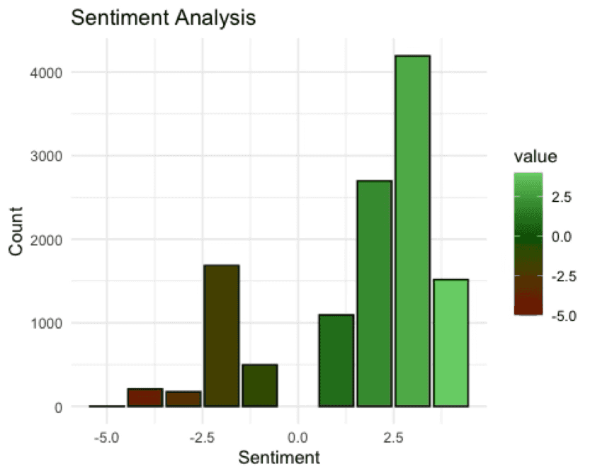 Figure 3: Sentiment intensity analysis using the AFINN lexicon.
This is useful where the strength of reaction matters, not just whether it is broadly positive or negative.
What the Comparison Shows
Using all three methods on the same tweet corpus gives a fuller picture than any one lexicon alone:
- Bing provides a fast headline read on polarity.
- NRC adds emotional differentiation.
- AFINN introduces intensity.
The exercise also makes the limitations of lexicon methods visible. They are efficient and interpretable, but they can miss sarcasm, context, negation, domain-specific language, and multi-word meaning.
Relevance to Spatial Work
The direct output here is not yet a GIS product. The value lies in method transfer.
If similar text were linked to coordinates, neighbourhoods, routes, venues, or planning cases, the same workflow could support:
- sentiment mapping by place
- before-and-after comparison around local events or developments
- clustering of recurring complaints or praise
- social interpretation layered onto conventional spatial datasets
That is the main reason to keep this project in the portfolio. It shows a complementary analytical skill that can feed into geographic work even when the demonstration dataset is non-spatial.
Limits and Next Steps
This is still a prototype workflow rather than a production-ready geospatial pipeline.
- The dataset is thematic rather than place-based.
- Lexicon methods are weaker on irony, slang, and context-heavy language.
- The current charts summarise sentiment, but do not yet connect it to geography.
A stronger next step would be to apply the same pipeline to geotagged or place-attributed text: planning submissions, visitor reviews, local incident reporting, or location-based social posts. That would turn the method from a text-analysis exercise into a fully spatial one.
As a portfolio piece, the post works best when read that way: not as a finished GIS case study, but as groundwork for future sentiment-informed spatial analysis.