

Maps tell stories better than tables of numbers ever could. In this post, I'll share how I used R to create maps that reveal population changes across Dublin's Electoral Districts (EDs) between 2006 and 2016.
Background
Ever wondered how a city's population shifts over time? Census data gives us the raw numbers, but visualising this data on maps helps us actually see patterns of growth and movement. These insights are good for urban planners, policymakers, and anyone interested in understanding how cities evolve.
I chose to focus on Dublin from 2006 to 2016 - a fascinating decade that included Ireland's economic crash of 2008 and the subsequent recovery. The Irish census, conducted every five years by the Central Statistics Office, provided the perfect dataset to explore these changes.
Data and Methodology
The Raw Materials
For this project, I worked with:
- A shapefile of Dublin's Electoral District boundaries
- Population counts from the 2006 and 2016 Irish Census
The data included various socioeconomic indicators, but for this analysis, I zeroed in on the total population figures.
The Toolkit
I used R for this analysis, with several handy spatial packages:
library(sp)          # Spatial data handling
library(sf)          # Simple features for R
library(RColorBrewer) # Colour palettes
library(shades)      # Colour manipulation
library(tmap)        # Thematic mapping
library(GISTools)    # Additional mapping tools
How I Built the Maps
Here's my step-by-step process:
- Getting data ready: First, I loaded the Dublin ED shapefile and converted it to a format R could work with.
# Load the shapefile for Dublin Electoral Districts
Dublin <- st_read("Dublin_EDs.shp")

# Convert to SpatialPolygonsDataFrame
Dublin_spdf <- as_Spatial(Dublin)-
Exploring what I had: I checked out the data to understand what fields were available and how the population was distributed.
-
Choosing how to show differences: I opted for equal-interval classification instead of the default quantile method. Why? Because I wanted the same population ranges to have the same colours in both maps, making it easier to compare them directly.
-
Picking colours: I went with the "Greens" palette - a gradient from light to dark green that makes it easy to spot high and low population areas.
-
Creating the maps: I made choropleth maps for both 2006 and 2016 data with identical classification schemes for fair comparison.
# Define shading with equal intervals
vacant.shades = auto.shading(Dublin_spdf$Pop_06, cols = brewer.pal(5, "Greens"), cutter = rangeCuts)

# Create choropleth map
choropleth(sp = Dublin_spdf, v = "Pop_06", shading = vacant.shades)

# Add map elements
choro.legend(533000, 161000, vacant.shades)
title('Dublin EDs by Population 2006')
north.arrow(xb = 691500, yb = 760000, len = 2000, col = "lightgreen")
map.scale(691500, 718500, 5000, "km", 1, 5)
The equal-interval approach was a key decision - it means that the same shade of green represents the same population range in both maps, making changes over time immediately visible.
The Results
Dublin Population - 2006
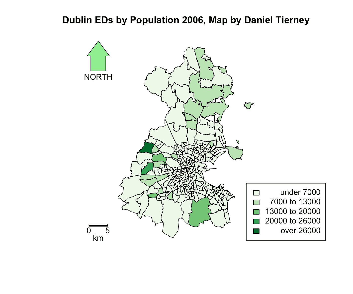 Figure 1: Dublin population by Electoral District in 2006
Dublin Population - 2016
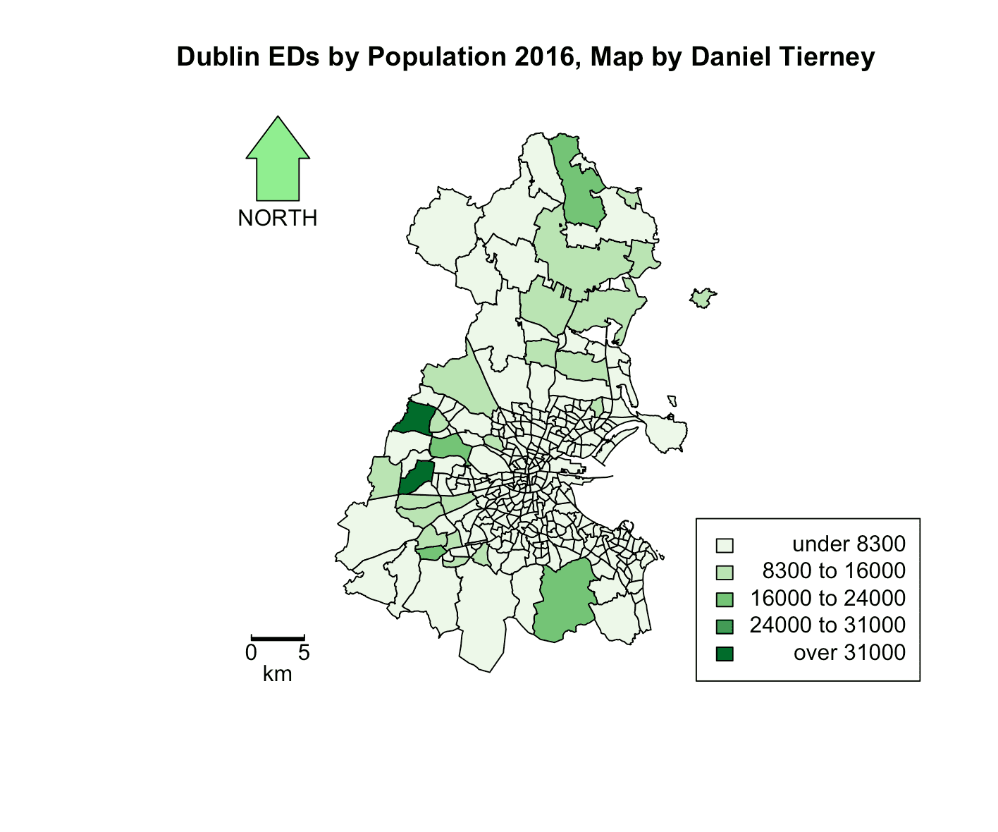 Figure 2: Dublin population by Electoral District in 2016
What the Maps Tell Us
Looking at these maps side by side reveals some interesting patterns:
-
Dublin grew overall: Most areas show darker green in 2016 compared to 2006, indicating population growth across the city.
-
The suburbs boomed: The most dramatic growth happened in suburban areas north and west of the city centre. This likely reflects new housing developments and Dublin's expanding footprint.
-
Population centres remained stable: The areas that were densely populated in 2006 generally stayed that way in 2016.
This outward growth mirrors what's happening in many cities around the world, where populations increasingly shift from central urban areas to suburban regions. A deeper dive could tell us whether this represents Dubliners moving outward or newcomers from other counties settling in these expanding areas.
Making Good Maps: The Technical Bits
When creating maps that compare different time periods, a few technical choices make a fierce difference:
-
Consistent colours: Using the same colour scheme for both maps makes comparison intuitive.
-
Smart classification: Equal-interval classification was crucial here - it ensures that the same shade of green means the same population range in both maps.
-
Clear map elements: Adding legends, scale bars, and north arrows helps readers understand exactly what they're looking at.
Wrapping Up
R's spatial tools make it surprisingly straightforward to turn census numbers into meaningful maps. This simple comparison of Dublin's population in 2006 and 2016 reveals clear patterns of growth and suburban expansion.
These patterns raise interesting questions about Dublin's housing policies, infrastructure needs, and planning for sustainable growth. Future analysis could explore connections with house prices, transport networks, or extend the comparison to include the 2022 census.
The Full Code
If you'd like to try this yourself, here's the complete R code:
# Import the necessary libraries
library(sp)
library(sf)
library(RColorBrewer)
library(shades)
library(tmap)
library(GISTools)

# Load the shapefile for Dublin Electoral Districts
Dublin <- st_read("Dublin_EDs.shp")

# Convert the loaded data to a SpatialPolygonsDataFrame
Dublin_spdf <- as_Spatial(Dublin)

# Setting up the plotting area
par(mar=c(1,1,1,1))

# Define shading for the 2006 population using 'Greens' colour palette and equal intervals
vacant.shades = auto.shading(Dublin_spdf$Pop_06, cols = brewer.pal(5, "Greens"), cutter = rangeCuts)

# Draw the choropleth map for 2006 population with the defined shading
choropleth(sp = Dublin_spdf, v = "Pop_06", shading = vacant.shades)

# Add map elements
choro.legend(533000, 161000, vacant.shades)
title('Dublin EDs by Population 2006')
north.arrow(xb = 691500, yb = 760000, len = 2000, col = "lightgreen")
map.scale(691500, 718500, 5000, "km", 1, 5)

# Repeat for 2016 population data
vacant.shades = auto.shading(Dublin_spdf$Pop_16, cols=brewer.pal(5,"Greens"), cutter=rangeCuts)
choropleth(sp=Dublin_spdf, v="Pop_16", shading=vacant.shades)
choro.legend(533000,161000, vacant.shades)
title('Dublin EDs by Population 2016')
north.arrow(xb = 691500, yb = 760000, len = 2000, col = "lightgreen")
map.scale(691500, 718500, 5000, "km", 1, 5)
And here's the function for creating equal intervals:
rangeCuts <- function(v, n) {
  # Get the minimum and maximum values of the data
  min_val <- min(v, na.rm = TRUE)
  max_val <- max(v, na.rm = TRUE)

  # Calculate the range of the data
  data_range <- max_val - min_val

  # Calculate the width of each interval
  interval_width <- data_range / n

  # Create break points at equal intervals
  breaks <- min_val + (0:n) * interval_width

  return(breaks)
}